Big And Tiny Silver Lake
Big And Tiny Silver Lake
Los Angeles
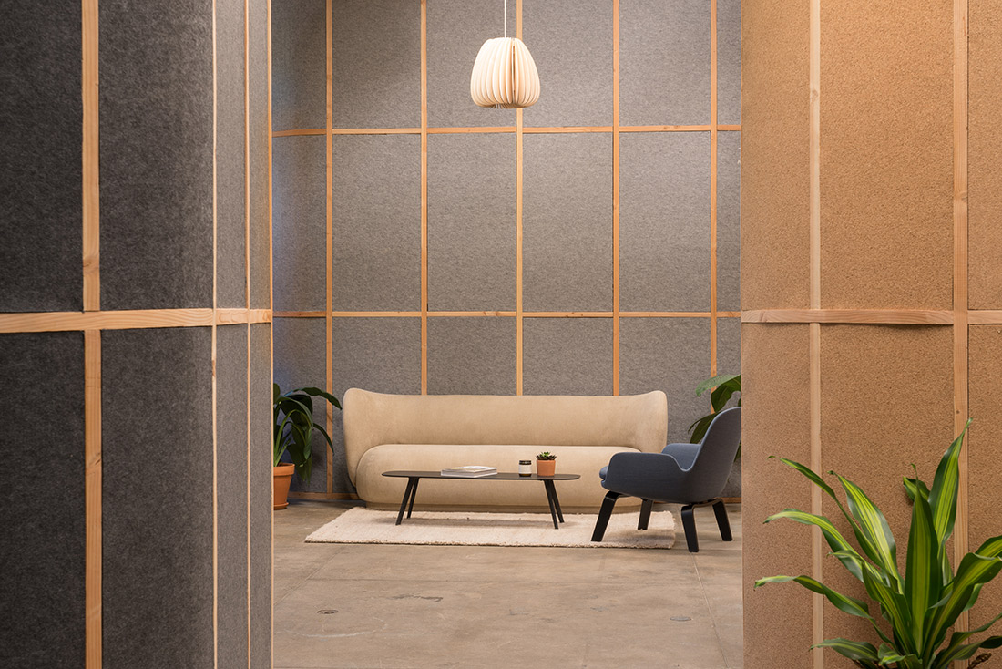
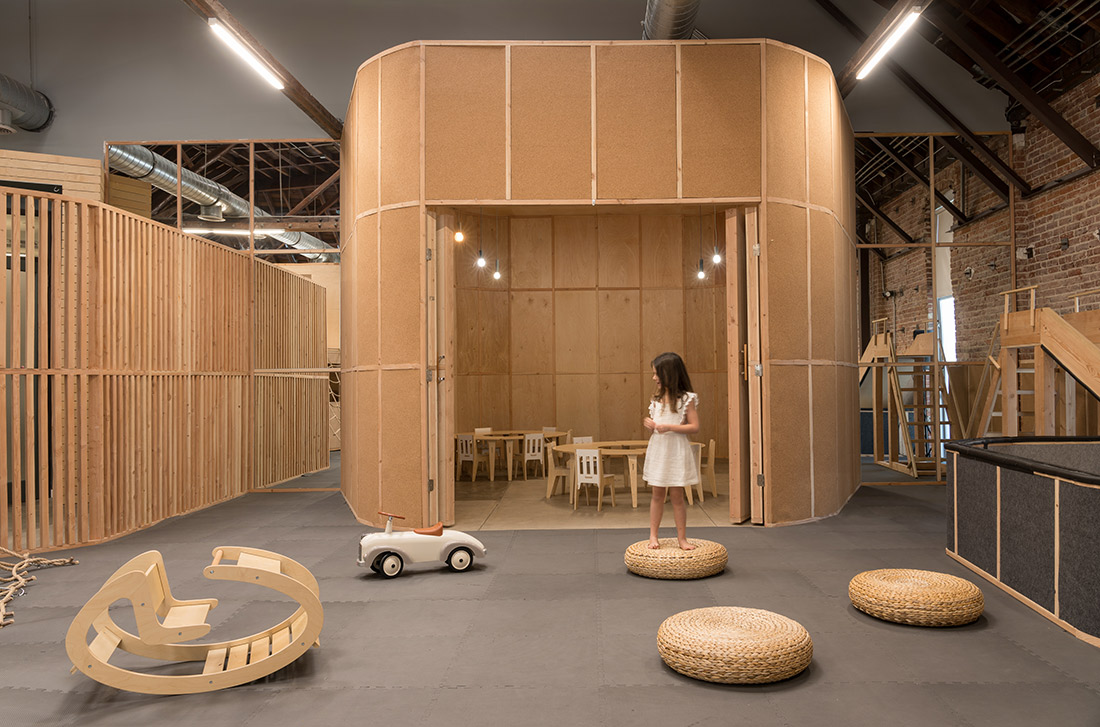
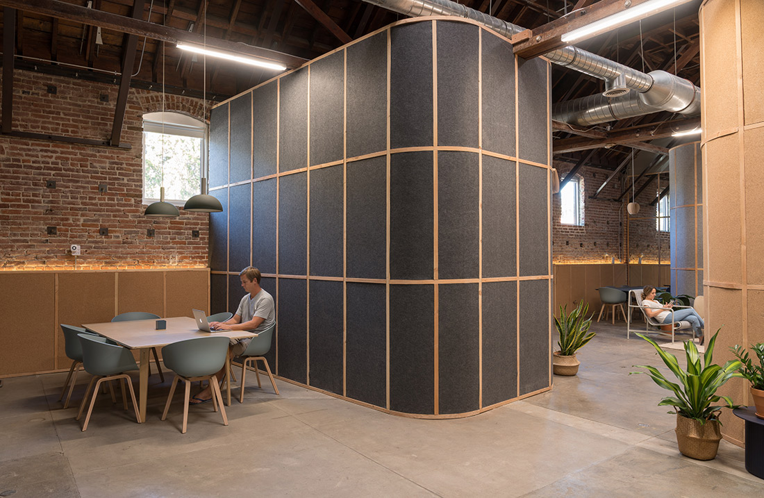
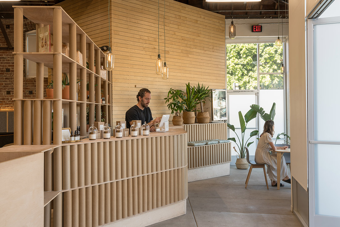
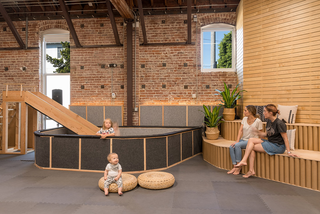
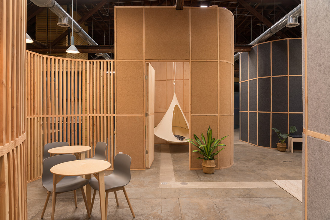
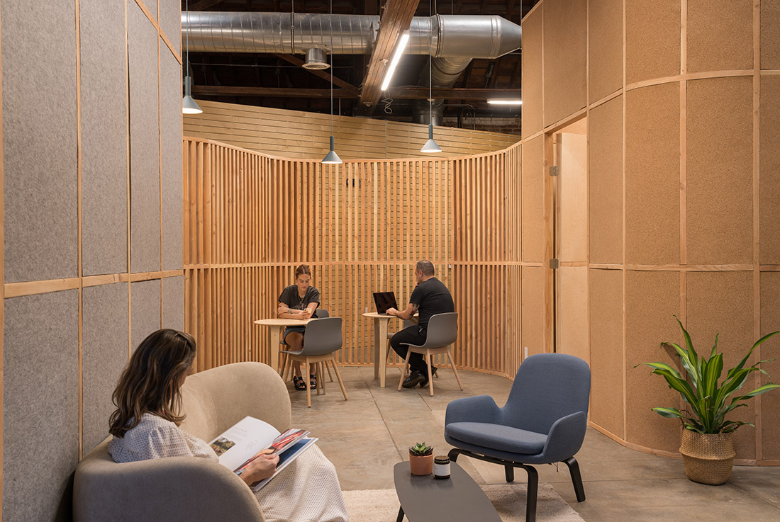
Out of the need for a cool spot for both kids and adults to enjoy. A place where families can grow in every aspect of their lives. This is how the idea of Big and Tiny was born. Big and Tiny opened the first space in Santa Monica. This project is the second local of the brand and it is situated in Silverlake (California) The Project covers a surface of 467m2 (5027 sq ft) with a max height of 6.50m (22 ft) and it is characterised by a visible roof structure of wooden trusses that cover the entire factory building and exempt the interior space of having structure. Besides the trusses, the building has a few closed volumes in different heights that contain maintenance functions as well as the actual bathrooms, kitchen and meeting rooms. The project is created under two different rules; the first one was to generate two different spaces acoustically isolated one from each other. This spaces are for the adult and the children public; the second one was to create in both spaces, open squares. We did it compressing the private uses in volumes that are ordered around this squares. We built a wall that splits up the building into two parts. This wall contains the acoustic isolation and is covered by mirrors in order to generate more amplitude in both spaces. Once this division is generated, we generated a constructive module that is repeated in the form of bands that runs those places. Through its expansion and compression, we covered the entire perimeter present in the premises. This spatial tension creates interior spaces that respond to the requested program, moreover at the same time, it creates the facade of the square that will be the main space for children or the space to develop various activities in the case of students. These bands materialize in different materials according to their use or function and even become lattices when we are interested in having a visual communication between spaces. Regarding materials we can shout out five: Wood, mirror, cork, felt and cardboard. The wood as structural elements and in the majority of the furniture generates quality and it relates to the originals volumes; the mirror in the central wall amplifies the children and adult spaces; the cork and felt are used as an exterior skin in cubes and baseboards; lastly, the cork is used in the counter and in the exhibition shelves as a way to organise and support the shelves. In a functional level, we build two cubes inside the children area (Tree House y Ball pit), two cubes inside the adult zone (Bike Cube y Silence Cube) and one cube in between the two areas connected to the children area due to it is used for the children parties. Every cube is connected through high baseboards or curves made of wooden slats. The whole is modulated by wooden panels of 2×4 ft (60x120cm) and by wooden studs of 2×4 inches. The studs are used as structure in the cavity walls and as independent slats in the connection curves. The module is visible in every wall of the project. Moving to furniture and lighting, Normann Copenhaguen, Sprout, Ferm Living and Peloton are the main brands that are in the project.
PRESS
DIGITAL PRESS
Elastica Magazine
Plataforma Arquitectura
Gooood
Nan
Archello
Retail Design Blog
Ait xia
Indian Art Design
Design Verse
Office Snapshots
Via Construccion
Detaggli Home Decor
Deck
Fahrenheit Magazine
Madera 21
Interior Design
Details D’architecture
Gigantic Forehead
Interior Design
World architecture News
Building Indonesia
Detail
Arkitecture on Web
C3diz
Newgenerations web
Archiol
AWARDS
Photography: Jim Newberry
Photography: Pixellab

