Zooco Santander
Santander
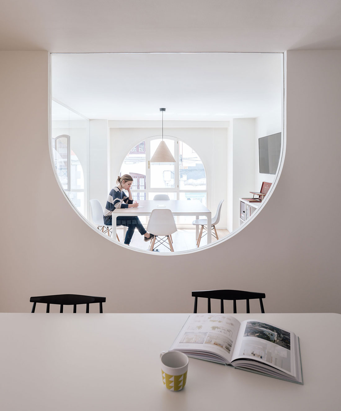
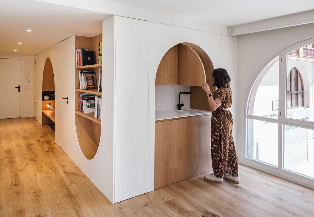
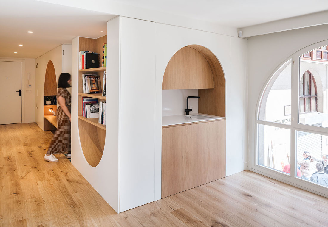
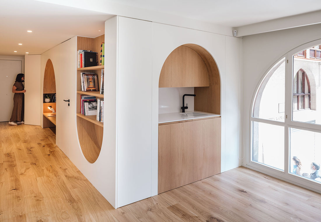
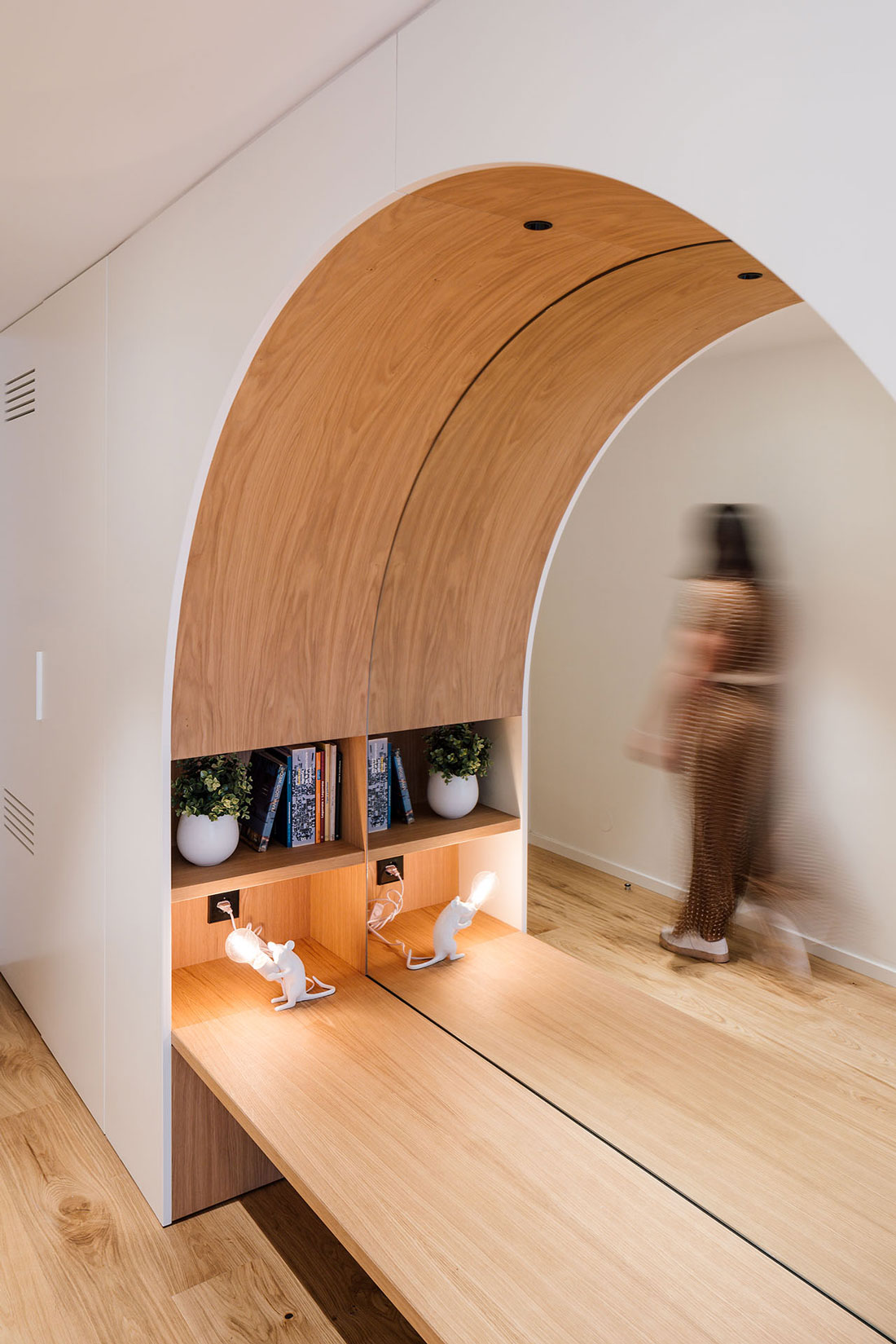
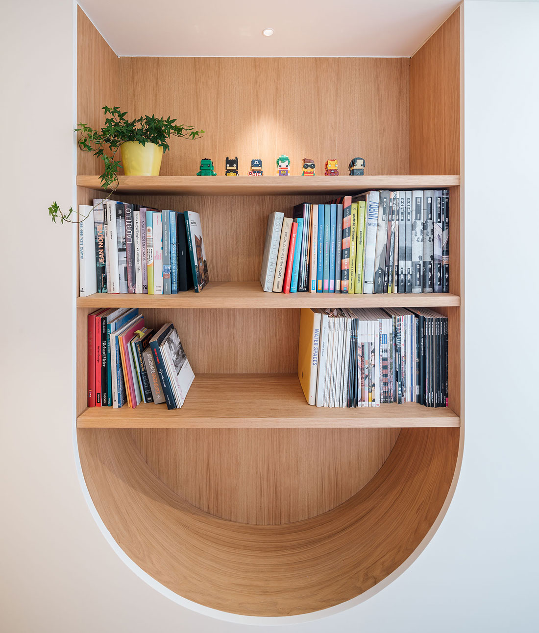
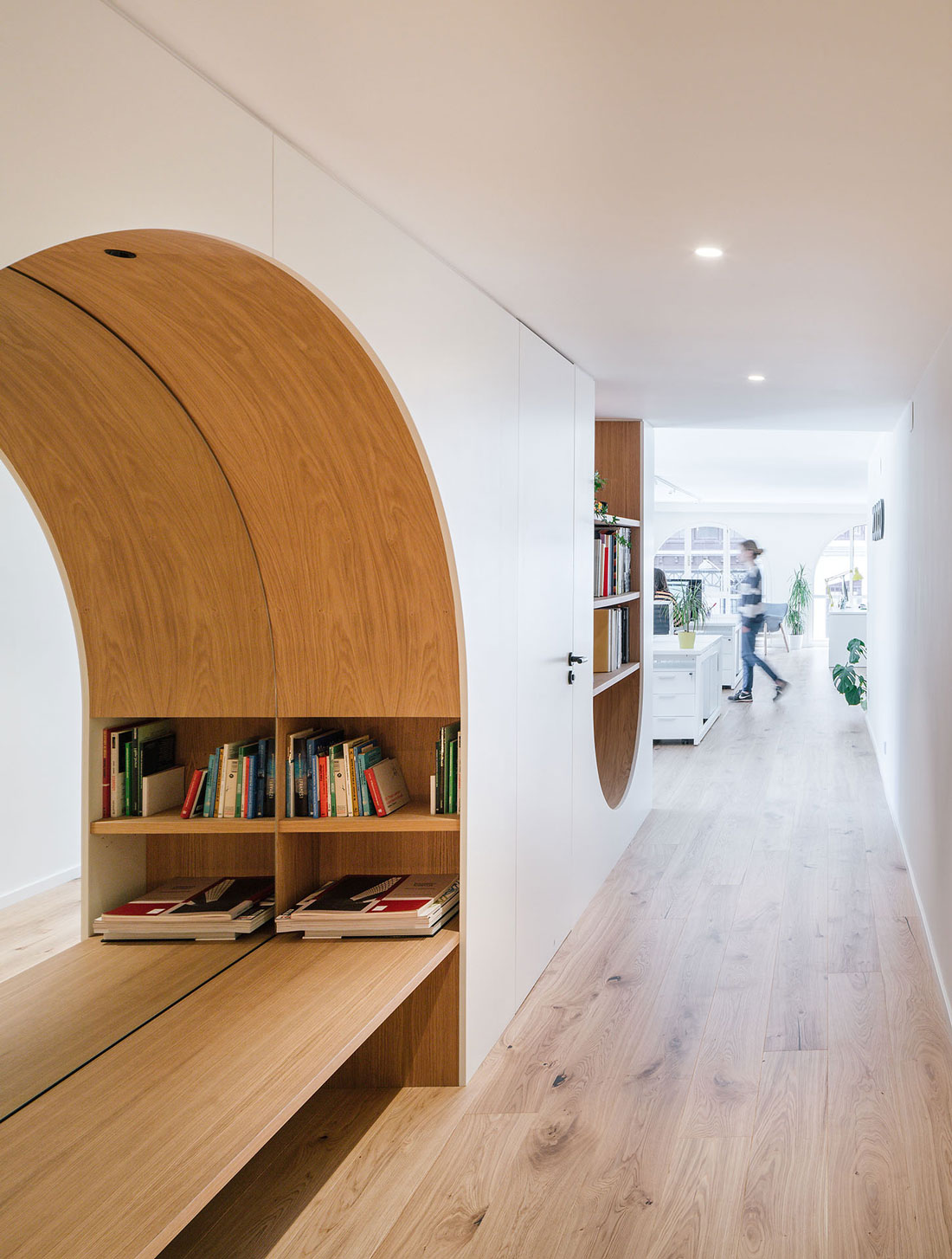
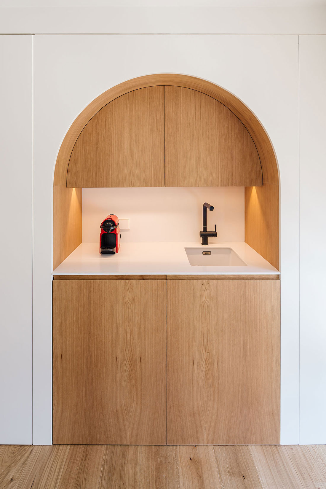
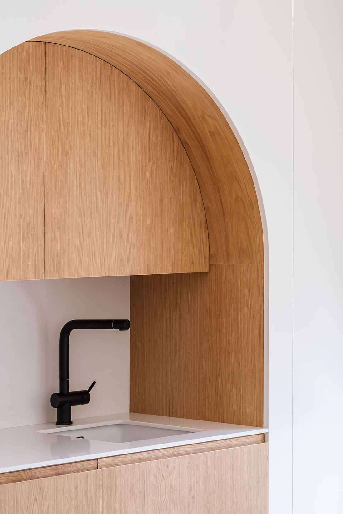
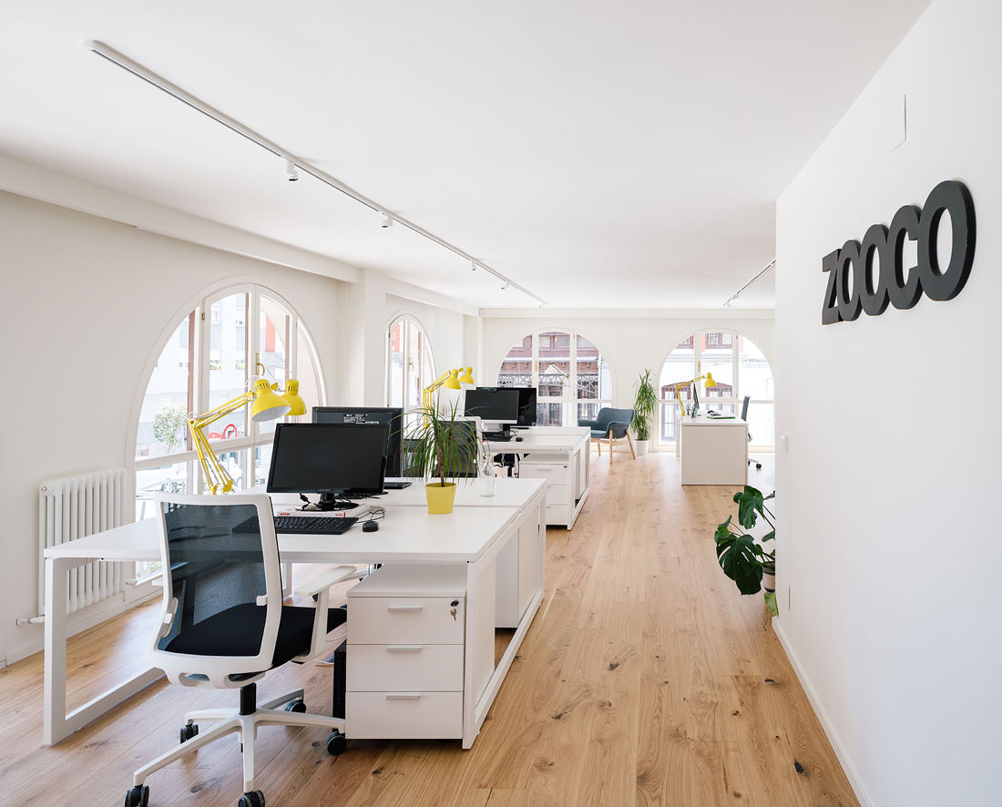
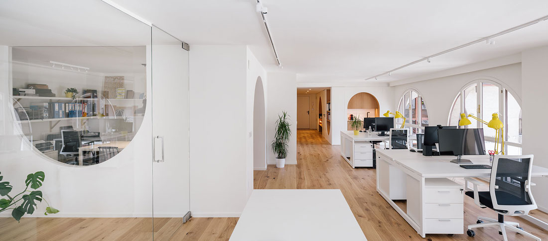
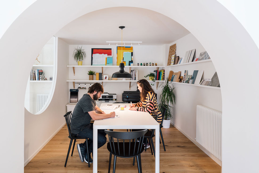
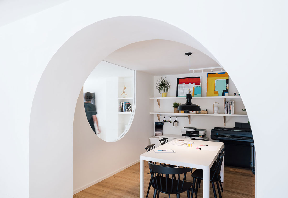
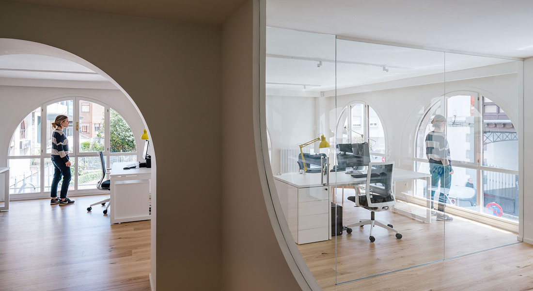
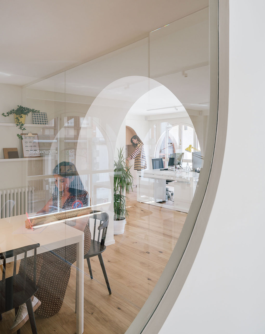
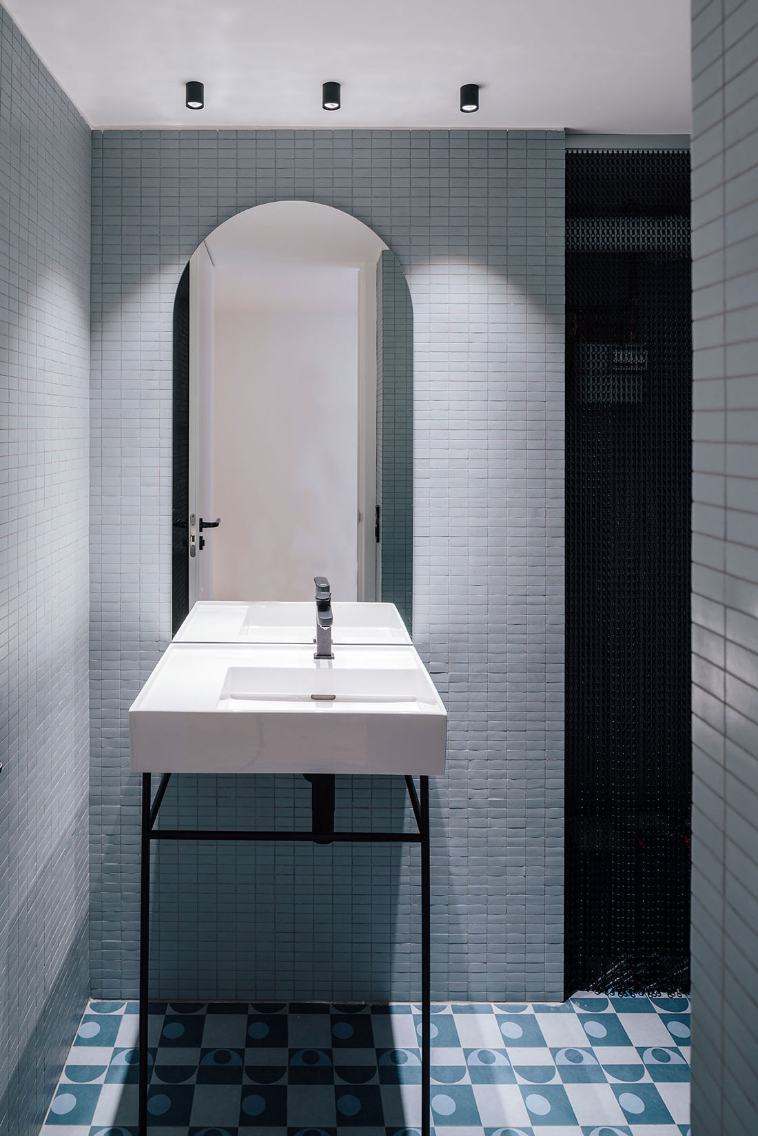
The place is located in a corner and it has two facades with a strong rhythm of windows with a semicircular top shape. This gives the space a great personality. These elements are so strong that it is going to be the leitmotiv of the local morphology itself. To solve the functional needs, the rounded arch is used as the only geometry, giving continuity and enhancing the pre-existing spatial language. In a completely diaphanous place, two elements are inserted in a way that organize the space to adapt it to the needs. The first of these elements contains all the services (toilet, office-kitchen, room for facilities and storage), while the other defines the two existing meeting areas, independent of each other, but visually connected. The rest of the space is conceived as a common room where work areas, relax and relationship are mixed. It is the distribution of the furniture itself, which establishes the circulations and stays, generating a flexible space that allows multiple configurations. The natural oak material is present in the holes of the arches and the floor. This material turns paramount due to the absence of color of the rest of the furniture and furnishings, creating a pleasant feeling of harmony.
DIGITAL PRESS
AWARDS
Photography: Imagen Subliminal

