Foyer – Cafe Palacio Festivales
Foyer – Cafe Palacio Festivales
Santander
The “Palacio de Festivales” of Cantabria, located in Santander, was built in 1990 with the idea of being the cultural landmark of the city and host the prestigious International Festival of Music and Dance held since 1952
For this purpose, a competition was held with 7 proposals, of which the winner was the architect Francisco Javier Saenz de Oiza (1918-2000). One of the most influential and important architects of Spanish architecture, with works as relevant as Torres Blancas (Madrid), the headquarters of the Bank of Bilbao (Madrid) or the “Palacio de Festivales”, a controversial and risky work but that ended up becoming a symbol of the city.
The building is a multidisciplinary space composed of three main halls, the “Sala Pereda”, the “Sala María Blanchard” and the “Sala Argenta”, and are designed to house a theater, film, music and dance.
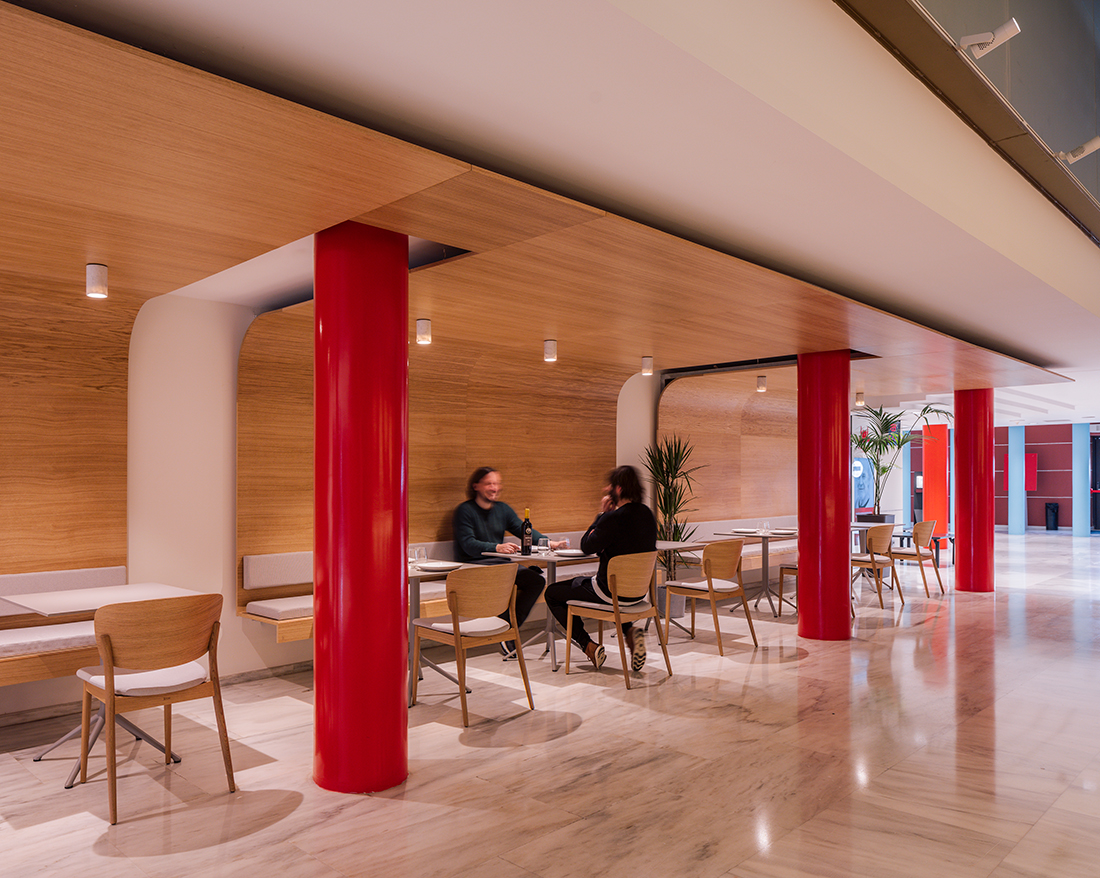
The ornamentation is post-modernist and inspired by the classical style, represented in the main materials, marble, aged copper and the red and blue colors present in various elements of the building.
The project is one of the actions of modernization of the building for the 30th anniversary of the same and involves the reform of the cafeteria in the lobby Foyer of the “Palacio de Festivales” de Cantabria, is located next to the “Sala Pereda” and its access is by Gamazo.
In addition to its use as a cafeteria when there are events at the Palace, it is also the entrance for the staff who work at the Palacio de Festivales and their visits, and gives access to the students and teachers of the School of Performing Arts.
The space, about 180 m2, presents the difficulty of belonging to a building so emblematic of the city and have that duality in its use, lobby – foyer and cafeteria for events.
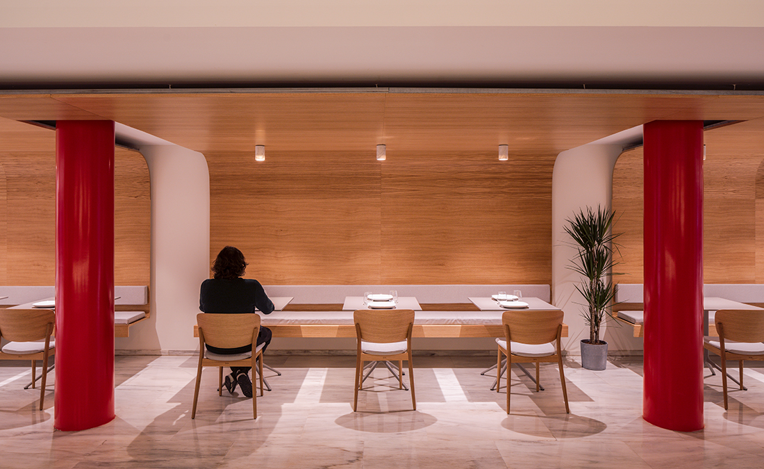
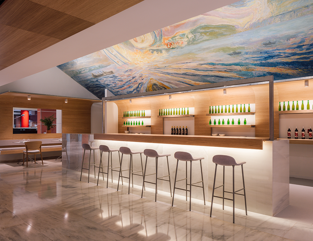
The first decision is to clean the space of all the foreign language to the original project, and to conceive a project that both formally and in its materialization does not modify the space.
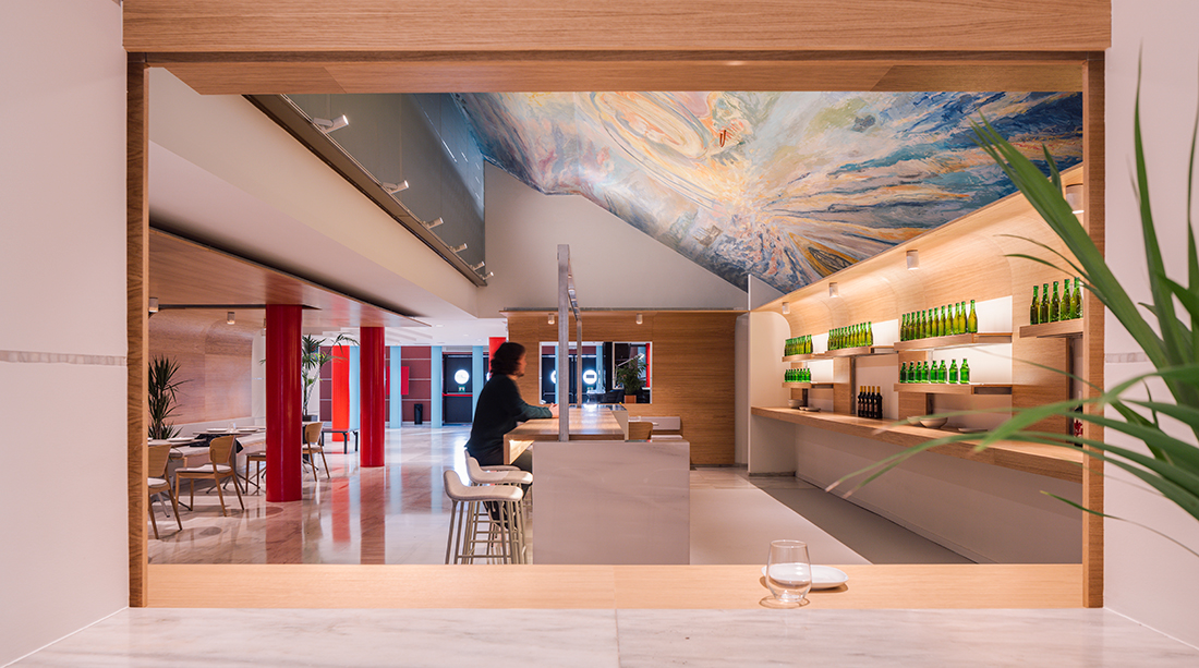
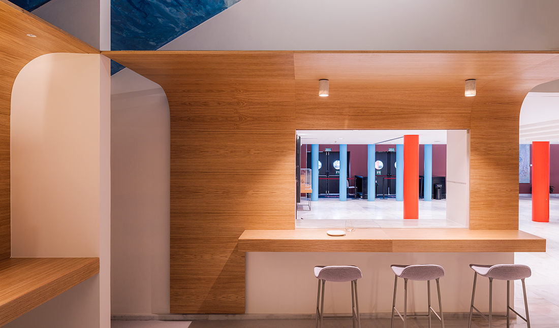
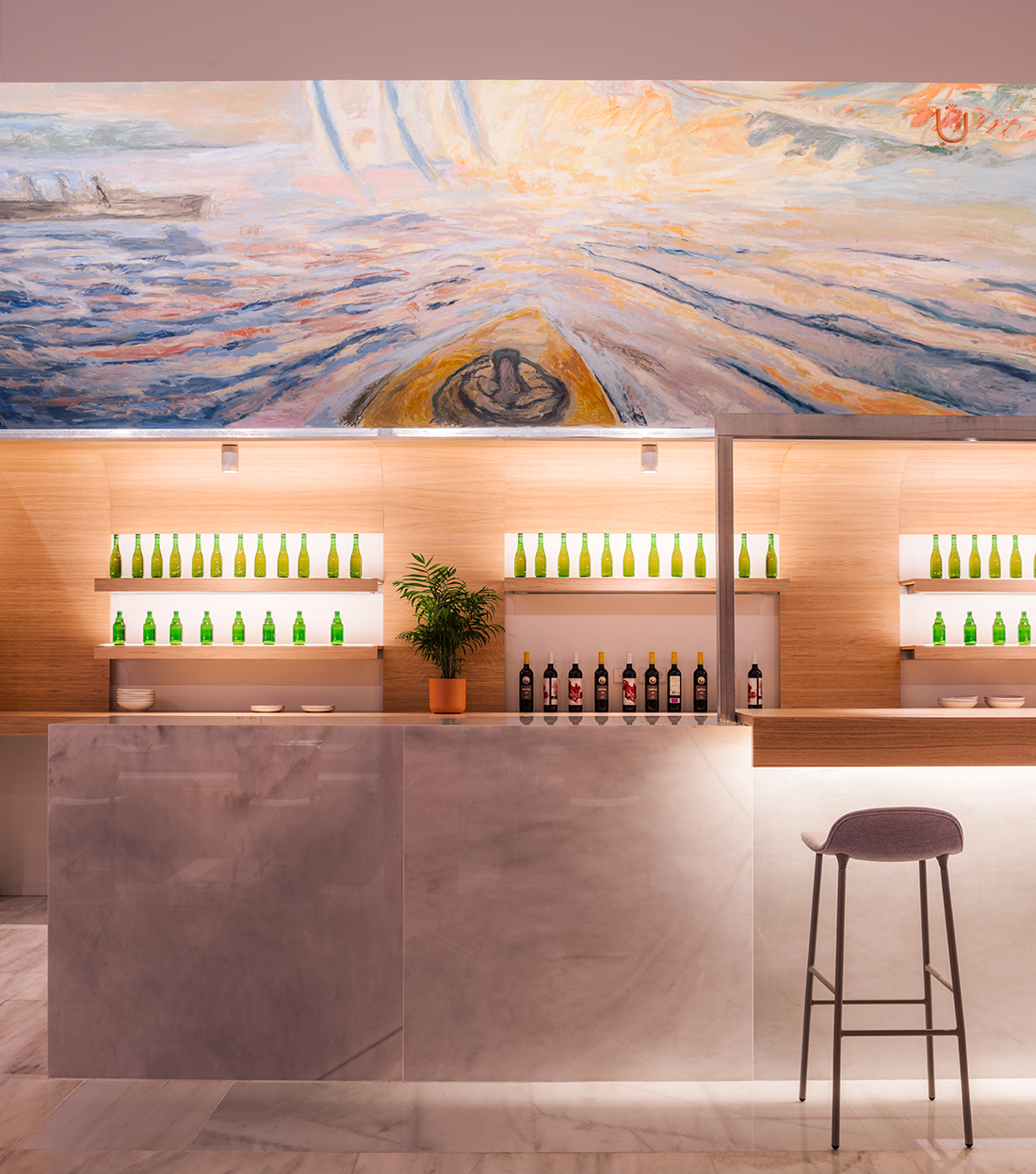
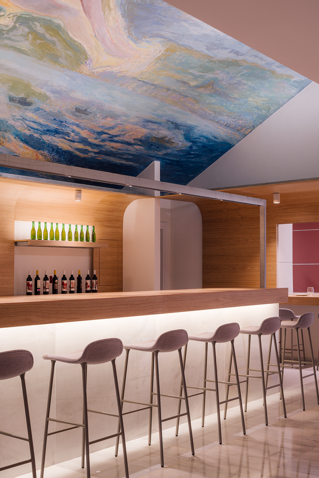
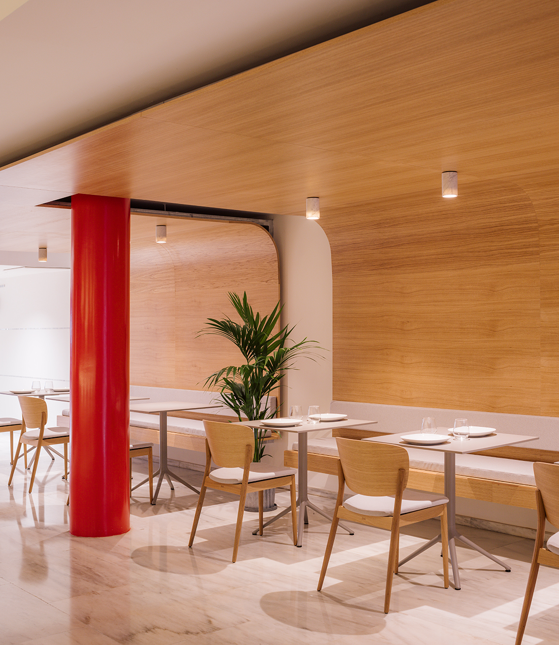
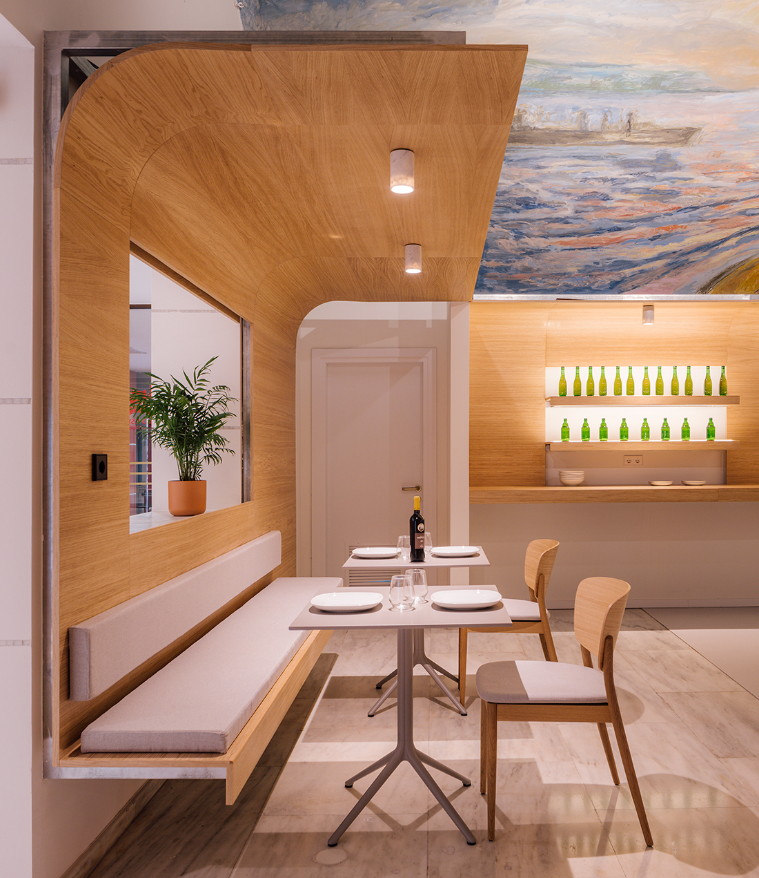
For this purpose, thin sheets of wood are conceived as a “tailor-made suit” that fits the pillars, walls and ceilings. A skin that “floats” lightly in the space and generates the necessary elements for the required use, ceiling to house lights, seat for tables and shelves in the backbar.
This thin skin is separated from its container and is broken or perforated to fit the original columns or existing holes, and is suspended from the ceiling, without touching the floor, to emphasize the desire to respect the original.
It does not try to compete, but simply with the minimum gesture, the minimum folds, to provide the space with what is necessary for its new use.
In terms of materials, the bar is a volume that rises from the floor continuing the original marble, as well as the lighting fixtures also in marble, but for the slats of this minimal “skin” wood is chosen, a material that is not present in the original project, so that the intervention is recognized as a complement to the existing and not an attempt to continue with the existing by transforming it.
In conclusion, the minimal addition of elements so that the space has a new use while respecting the existing.
PRESS
Photography: Imagen Subliminal

