Melguiza
La Melguiza
Madrid
The client asks us for the idea of create a new store concept in which all the product will be related with saffron.
Saffron is known as something tiny, lightweight, but extremely precious and with a large component of tradition.
Bearing in mind these features, we try to bring them to the project and reflect them into the same, but with taking into account the conditions of a store.
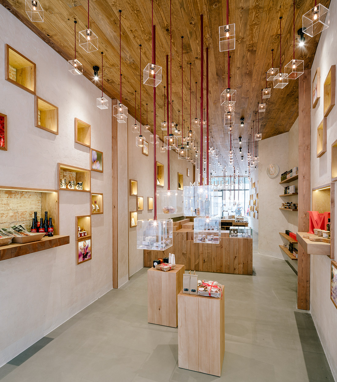
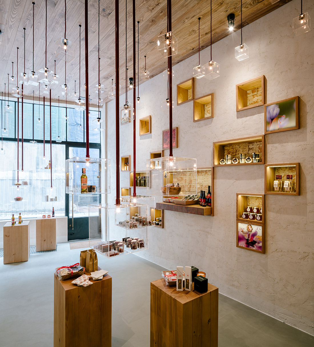
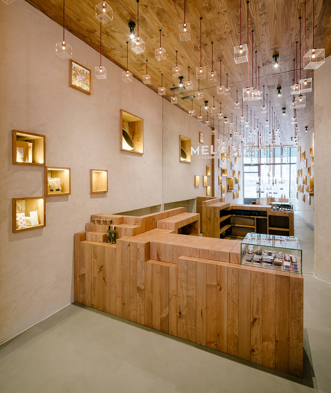
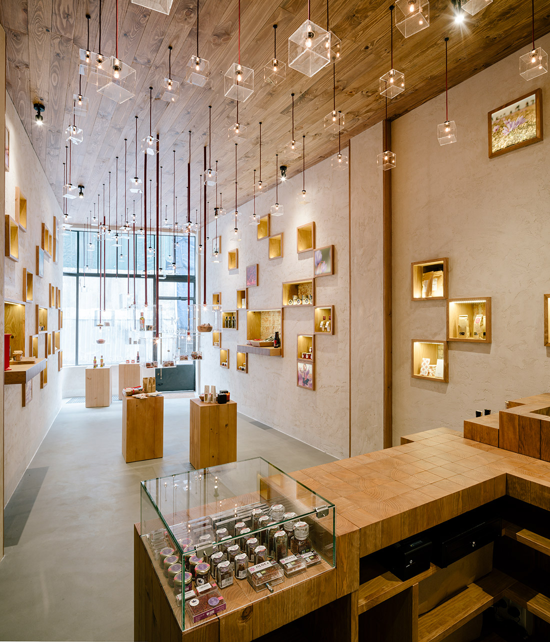
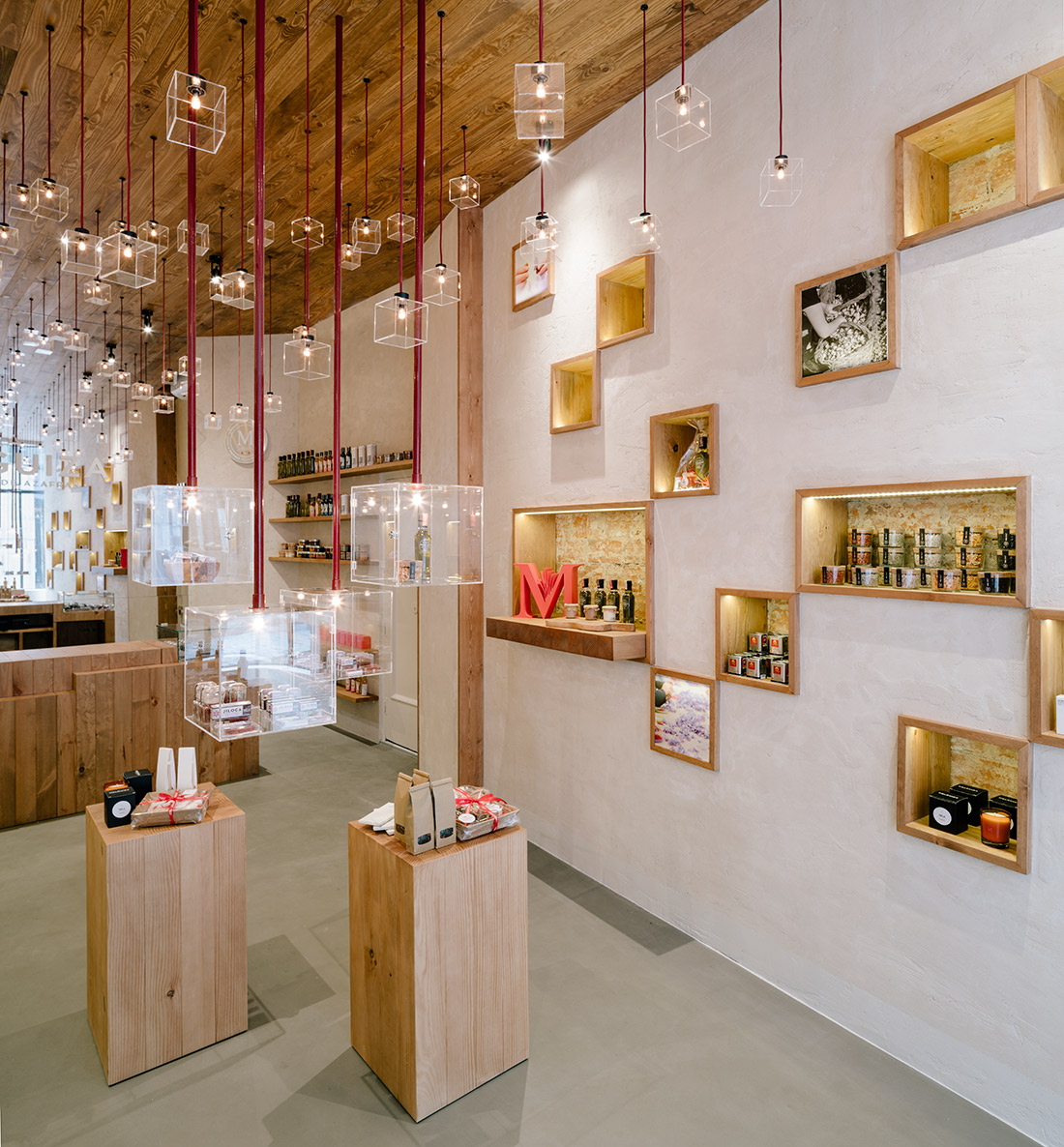
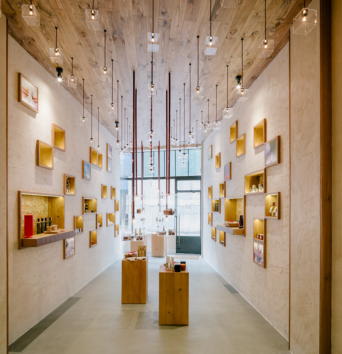
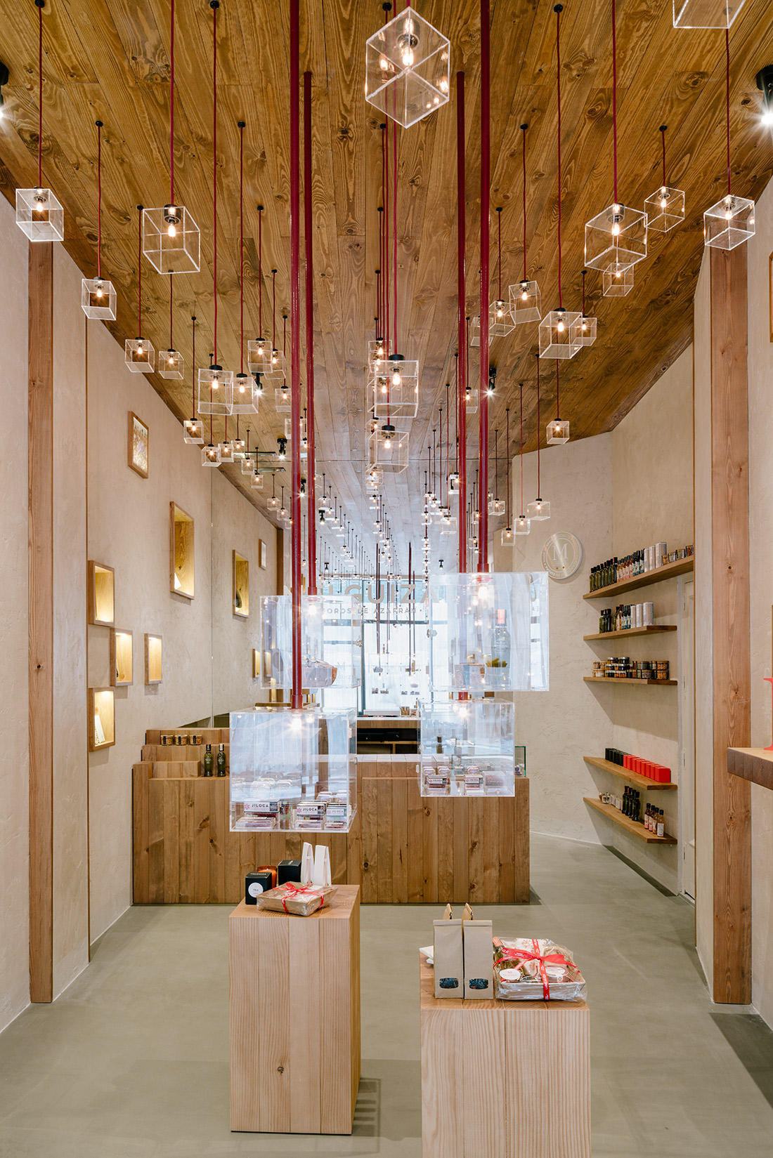
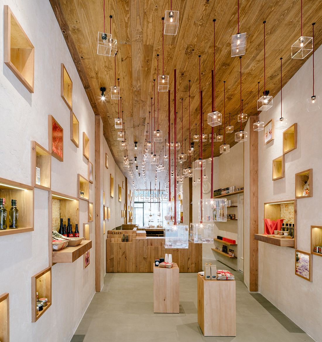
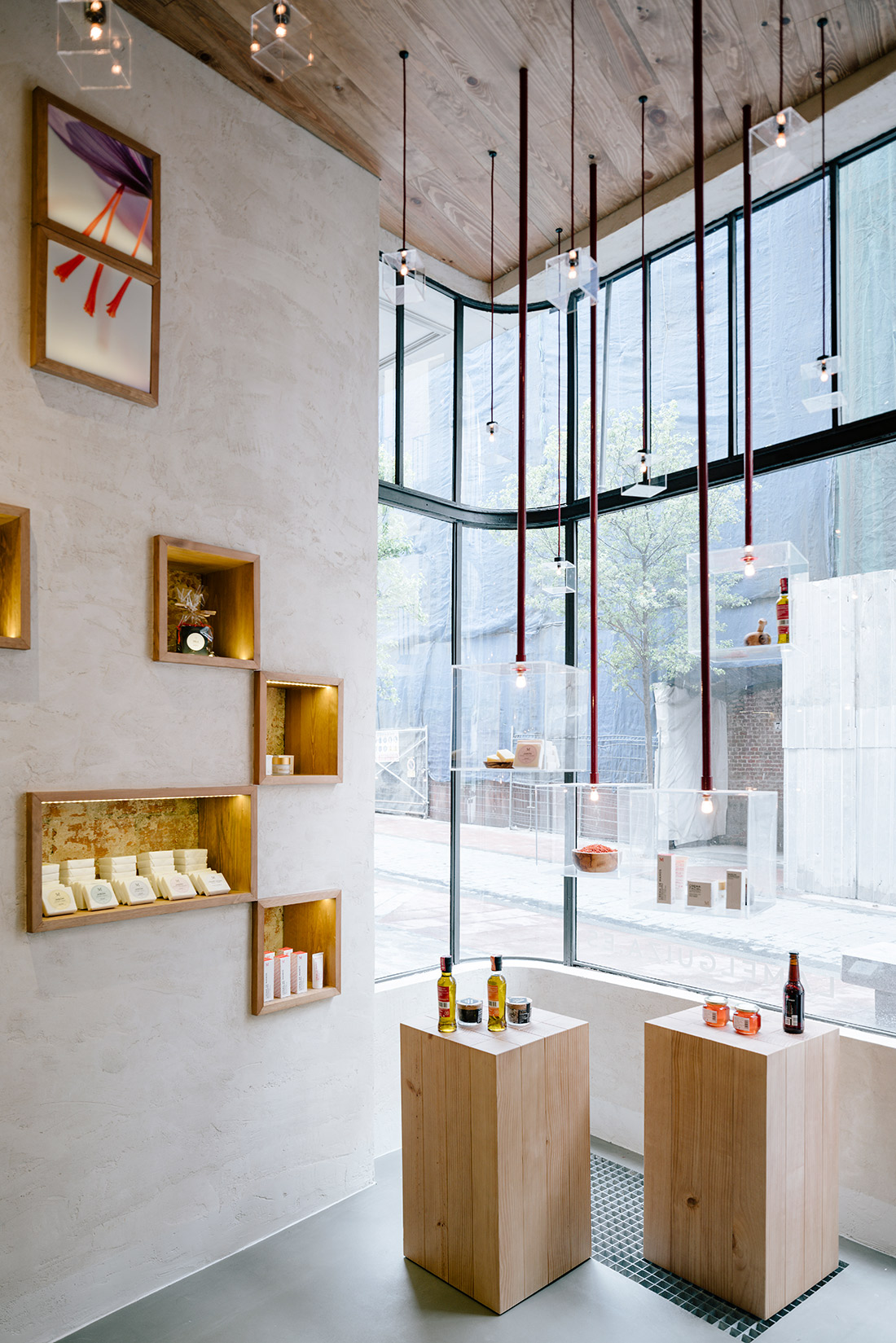
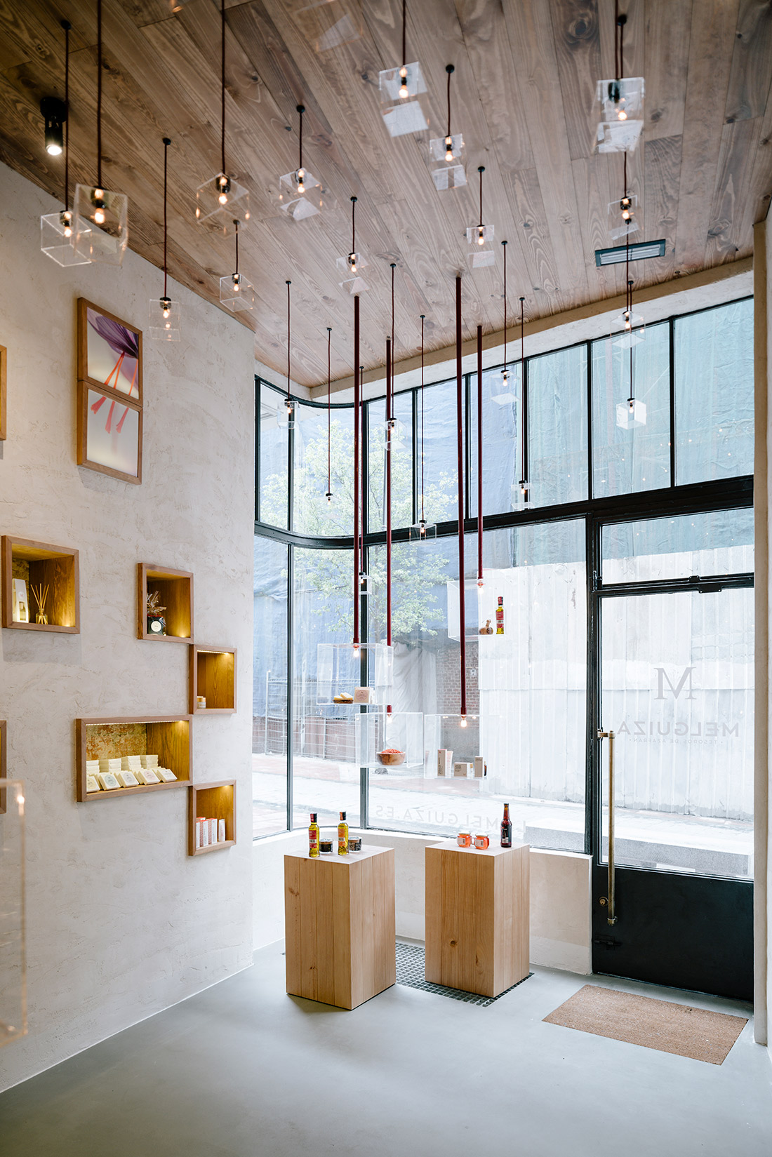
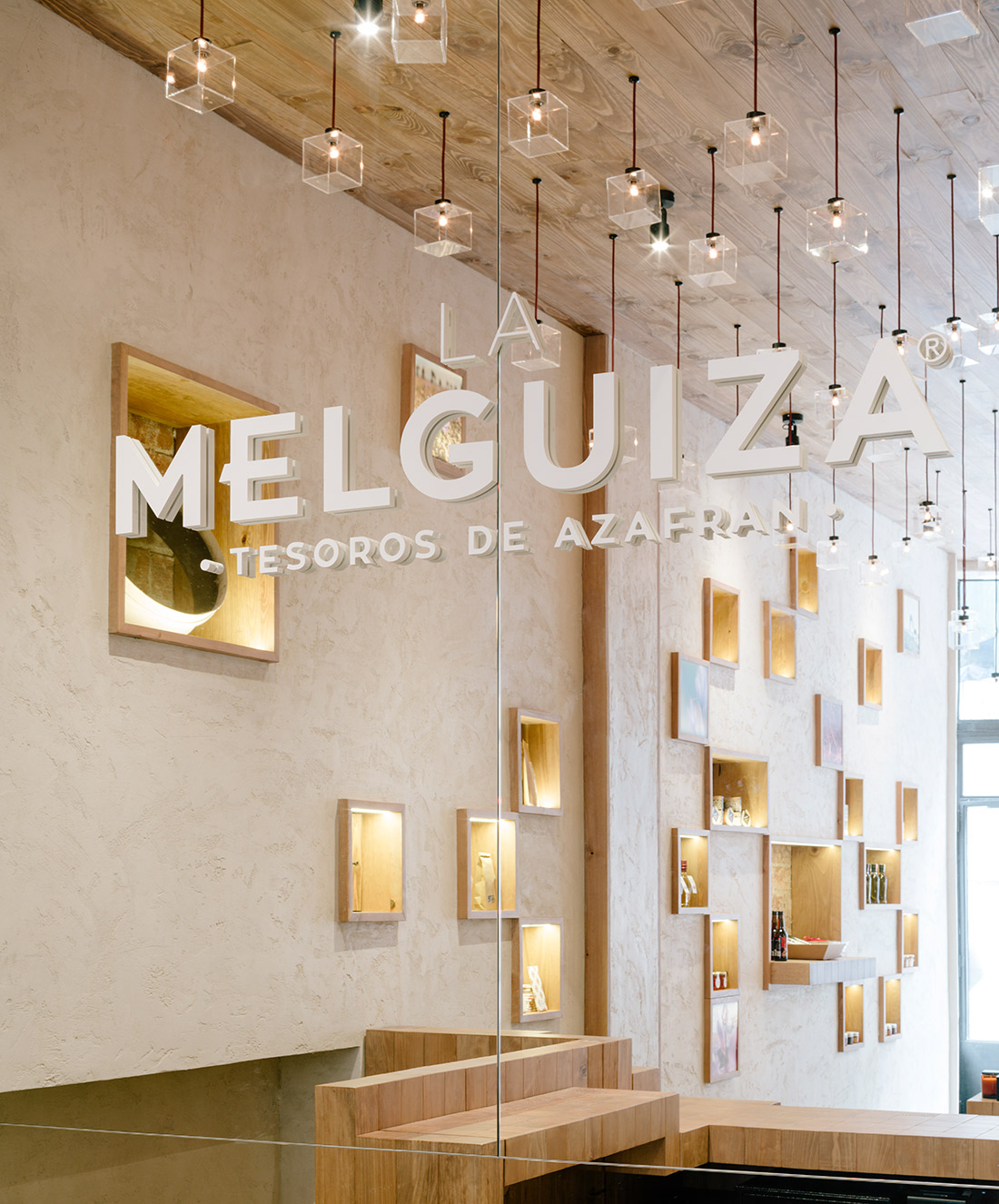
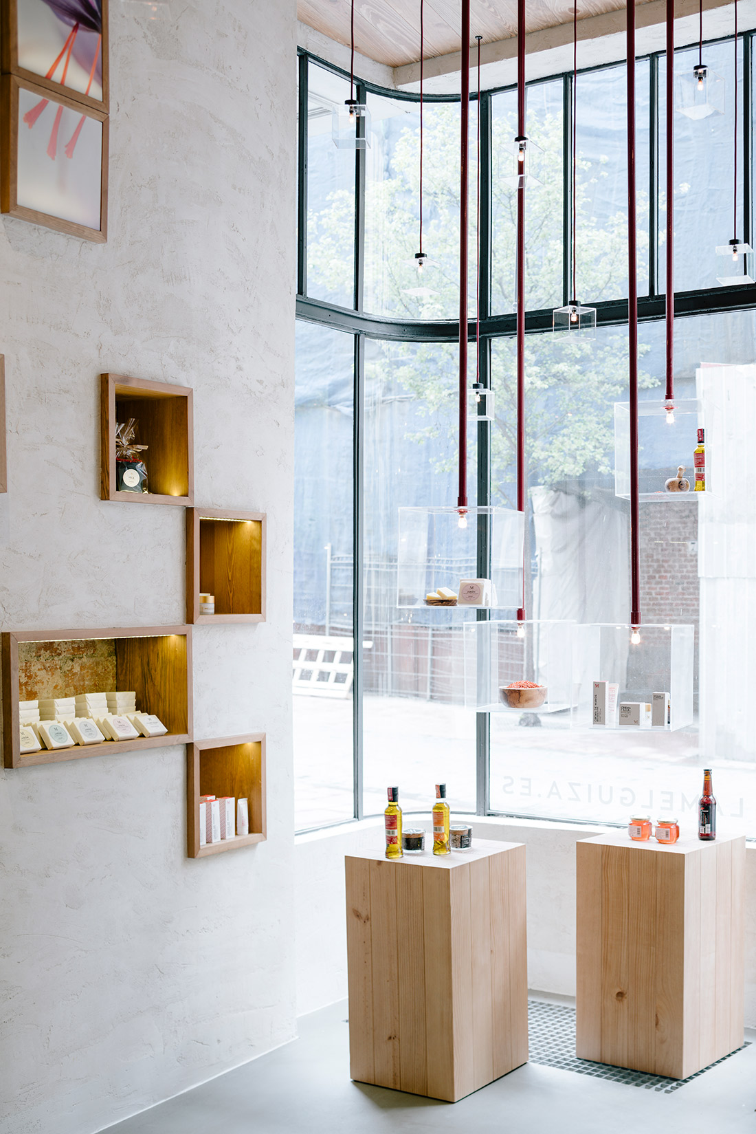
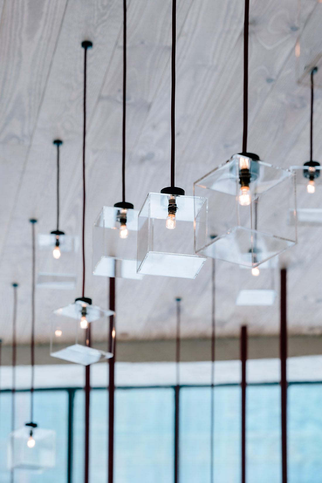
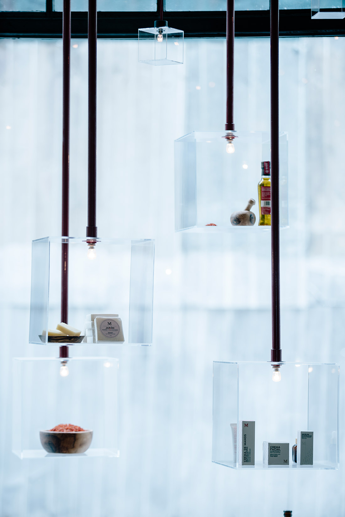
To that end, a system of lights and hanging exhibition spaces has been created to make a topography of strands along the store. This approach leave the ground plane clean to give more significance to the space. These are red linear elements, where transparent boxes are hanging to place light and products according to the shop area.
The place is flooded with light spots and products that seem to be suspended in the air reminding the idea of lightweight and value.
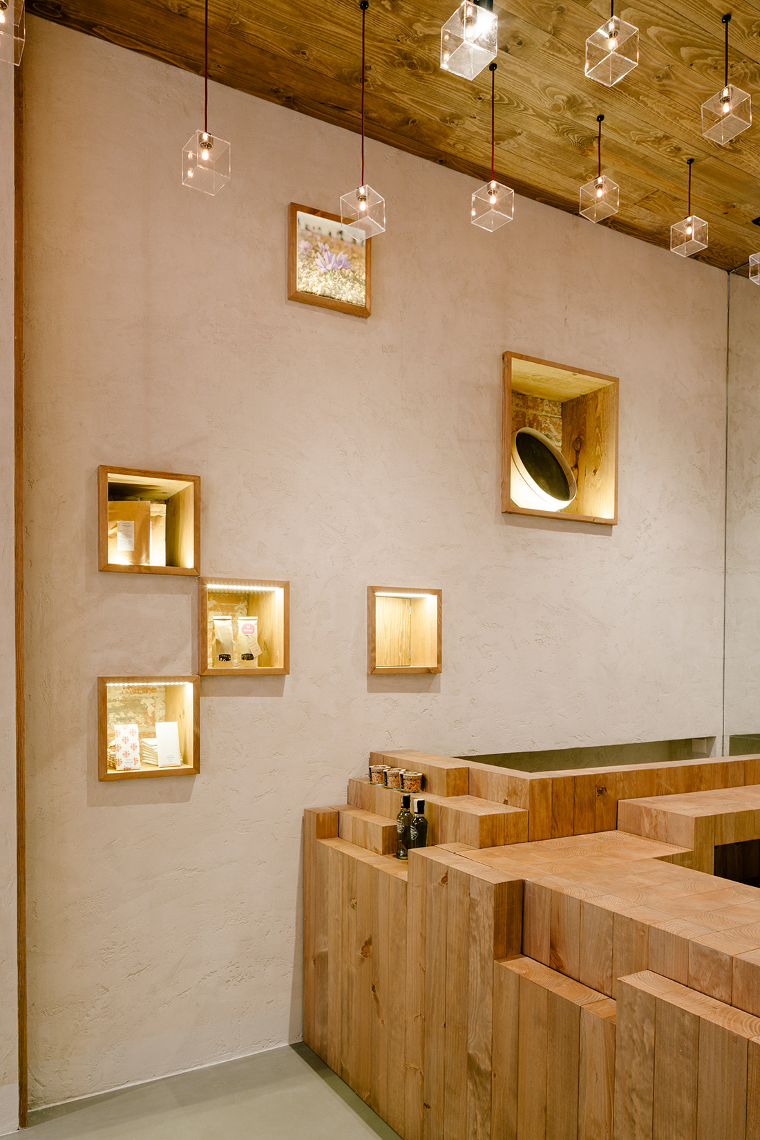
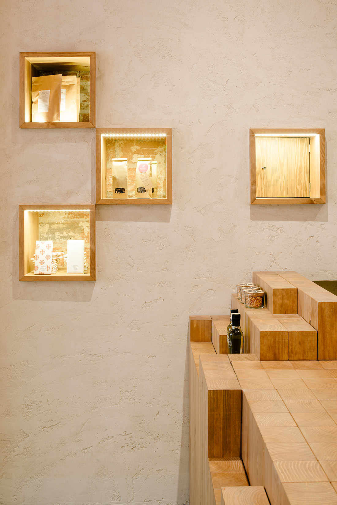
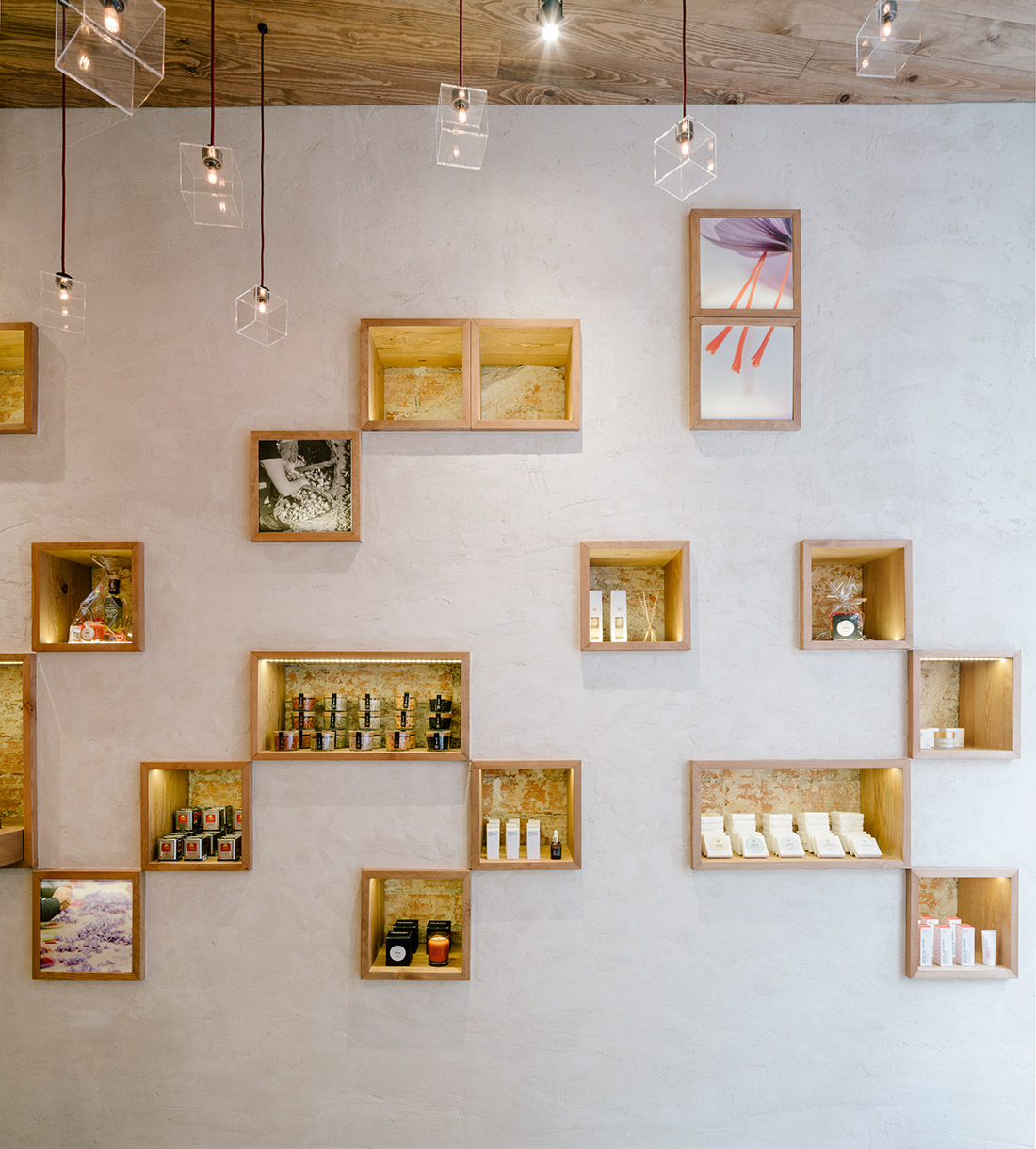
The surrounding area evoke the tradition of saffron. We use a color and material scheme that correspond with the typical building where harvesting and roasting of saffron were made: constructions with stone floor, whitewashed walls with small holes and wooden ceilings.
These small holes that colonize the walls work in addition to the pendant exhibitors boxes and the counter which uses the same language designed in the store.
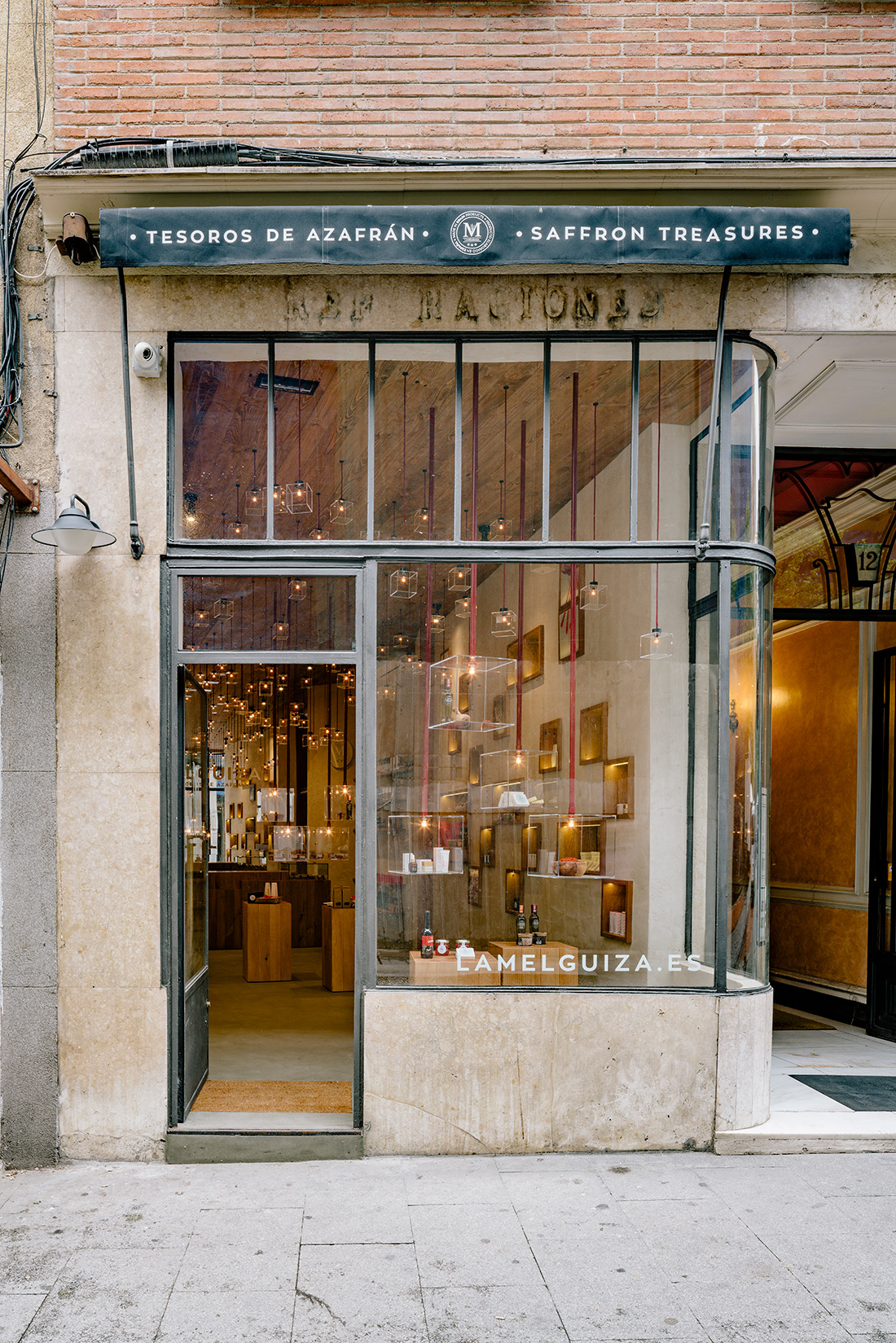
On the outside, the facade is completely transparent, so the vision of the store and the ceiling topography is complete and attractive to pedestrians.
DIGITAL PRESS
PRESS
Photography: Miguel Guzmán
Graphic design: Diseño gráfico: Mutta

