DomésticoShop Hortaleza
Madrid
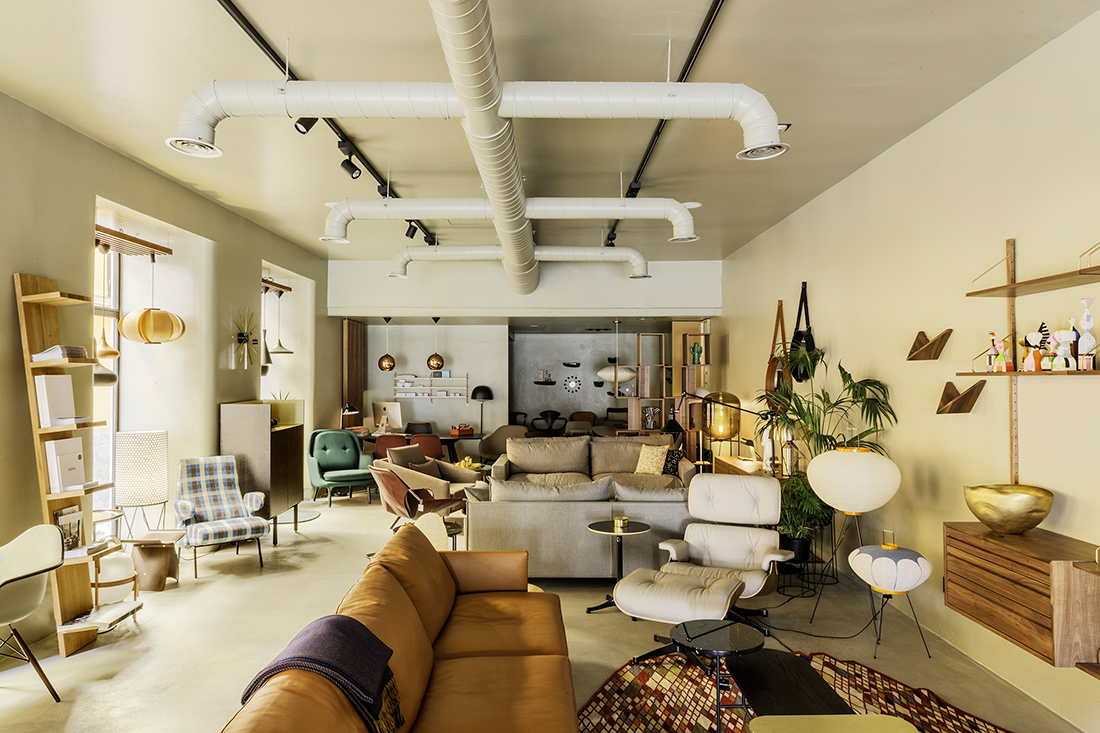
The client asked us for the idea of remodelling his store, located in Hortaleza Street (Madrid). Its design should be neutral, timeless and functional to exhibit the amount of furniture they sell.
To that end we adopt the idea of emptying all the space that the local embraced, including the storefronts and removing any kind of visual barrier. The furniture placement would set up the space.
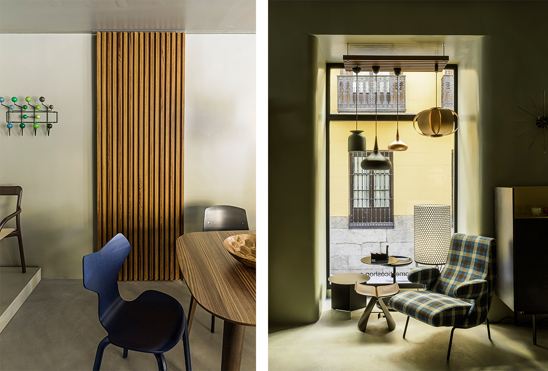
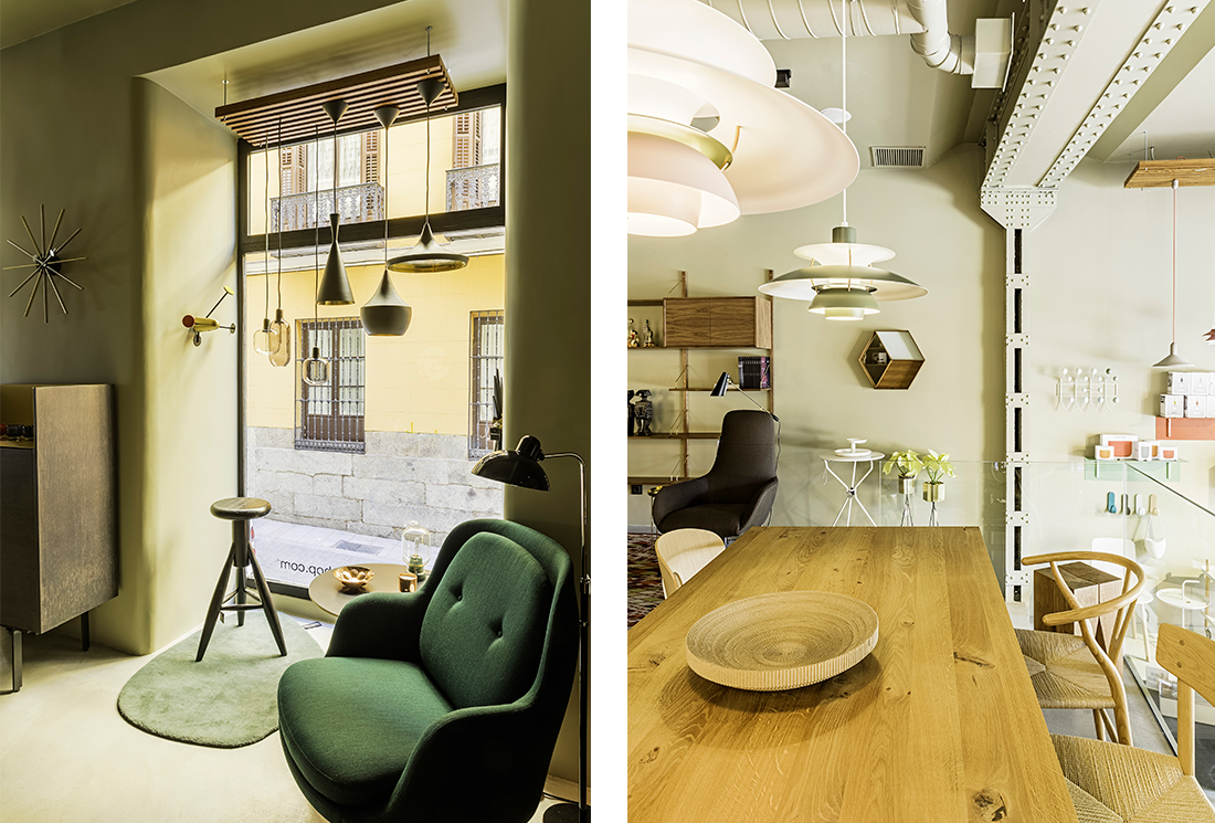
The store must be the backdrop that give priority to the furniture. Therefore, we used a neutral color scheme where white color dominates both walls and ceiling. Only the design of some details, like doors and lamp holders, is made with slats of wood, giving a point of warmth to the space
A stone pavement of smoothed microcement is chosen to finish off the industrial character of the local, which lets the metal structure and the Stone façade seen, as well as ceiling installations.
The result is a neutral container, where furniture and lighting are the protagonist of the space.
DIGITAL PRESS
PRESS
Photography: Orlando Gutiérrez


